

Krea 3 Ink Illustration Editing: Keep the Linework Consistent
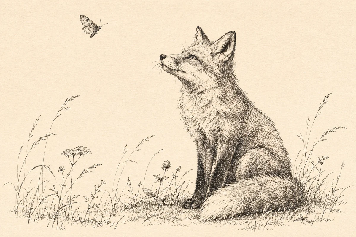
A small addition can change the balance of an ink illustration. If a new moth has a heavier outline than the fox below it, the drawing starts to feel like two different pieces. For Krea 3 ink illustration editing, define the new element and the marks it should share with the source, then compare the returned image with the untouched drawing.
You can prepare this revision in the Krea2 image editing workspace with Krea3 selected in Image-to-Image mode. Krea's launch article describes editing paintings and ink drawings while maintaining their medium. The following workflow is an editorial method for planning and reviewing that kind of change.
Describe the marks that already exist
Start with a clear scan or export of your own illustration, or artwork you have permission to edit. Keep an untouched copy at its original dimensions. For a photograph of paper artwork, correct distracting camera distortion and uneven lighting before using it as the source.
Our example is a seated fox with a few meadow grasses, drawn in black ink on ivory paper. The requested addition is one small moth in the open area above the fox. Before writing the prompt, inspect how the existing artist handled edges and shadows.
Look at the outer contour, the shorter fur strokes and the hatching beneath the animal. Note whether the darkest shapes use solid black or many crossing lines. Describe the paper tone too. Those observations give the new moth a visual vocabulary.
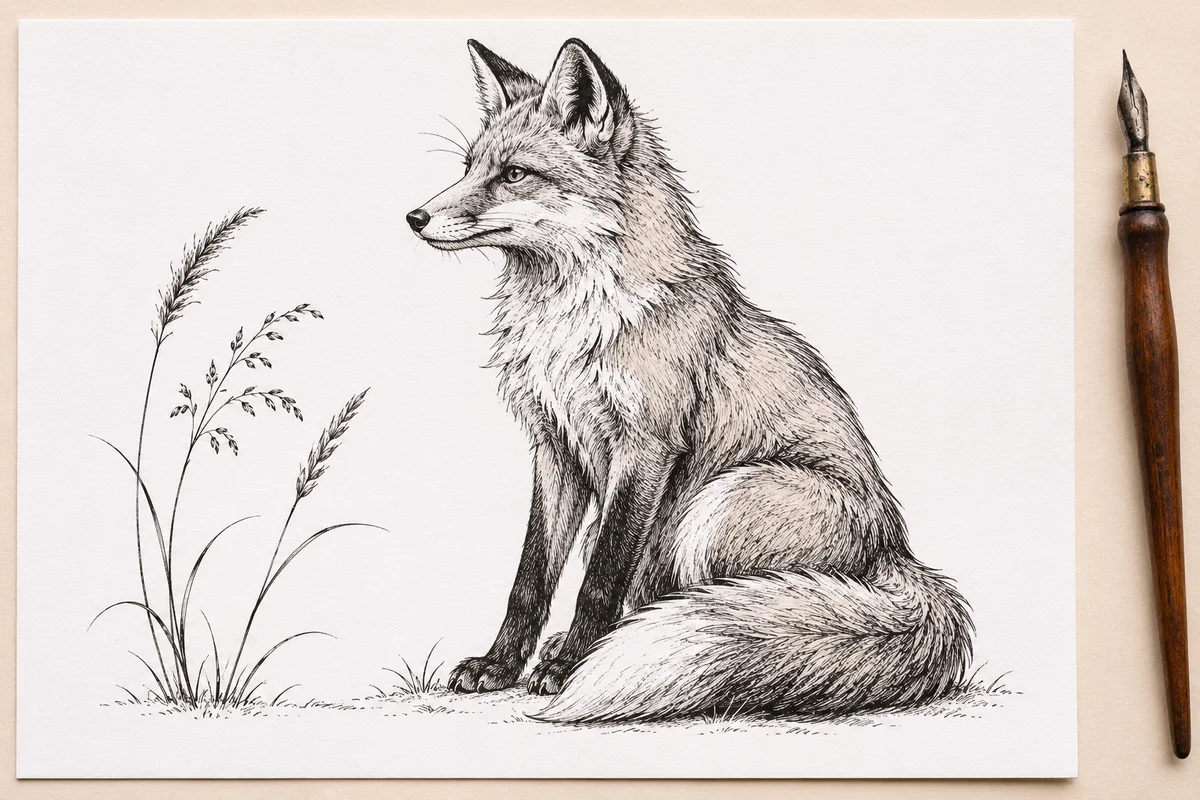
Generated illustration of preparing a source drawing.
Make the addition fit the empty space
Choose where the moth should sit in relation to the fox and the page edge. Leave enough room for its wings to read as a separate shape. Decide whether it belongs near the fox's eyeline or farther away in the surrounding space.
Use a single change for the first attempt. In the workspace, upload the drawing, confirm Krea3 and Image-to-Image, select an output aspect ratio that matches the source, and review the displayed credit cost. Then adapt this original prompt to your image:
Preserve the seated fox, the meadow grasses, their placement and the ivory paper background from image 1. Add one small moth in the open space above and to the left of the fox. Draw it in the same black pen medium, with a fine outer contour and sparse short hatch marks that match the existing illustration. Keep clear paper between the wings and the fox's ears. Retain the original page framing, black ink palette and quiet open areas. Add no lettering or extra plants.
Use descriptions that you can check in the result. “Improve this illustration” leaves the subject, shading and composition open to revision. The Krea 3 prompt guide explains how to make preservation requirements explicit.
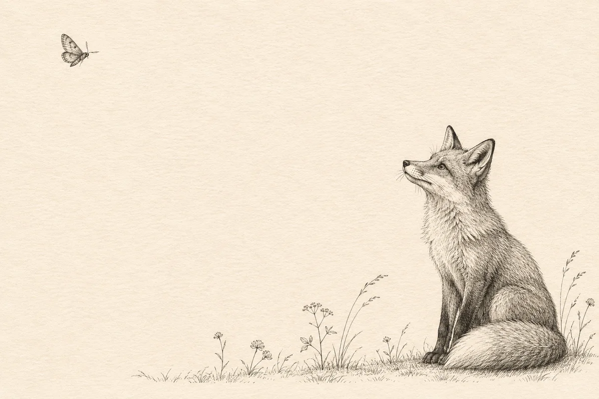
Generated composition study showing the intended spacing.
Compare the whole sheet before judging the moth
Put the returned image beside the original at the same displayed size. First check the fox's silhouette, the grass count, the page framing and the balance of empty paper. This catches broad changes that are easy to overlook when you zoom straight into the addition.
Then inspect the moth and its relationship to the original marks. Its contour should fit the drawing's line hierarchy. Its hatching should describe the wings without becoming the darkest patch on the page. Check whether the background around it matches the rest of the paper.
If the source has fine irregular pen strokes, look for areas that have become unusually smooth or uniformly thick. Also check gaps between lines, especially around the fox's face and the grass tips. A visually coherent medium depends on those small spaces as much as on the dark marks.
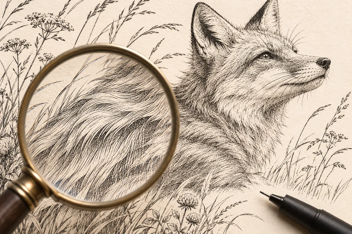
Generated detail study for checking linework. This article's illustrations explain the review process and are separate from a Krea3 output test.
Correct one visible mismatch
Keep the untouched drawing available for the next attempt. If the composition is right but the moth is too dark, revise that specific part of the brief:
Keep the moth small and in its current upper-left position. Use a thinner outer contour and fewer interior hatch marks so its visual weight matches the light grasses. Preserve the original fox drawing, page framing and ivory background.
Compare the new result with both the source and your previous candidate. If the fox or paper has changed, return to the original input and narrow the request. A close-up reference can help explain an existing mark, but inspect what information it adds before uploading it. The reference image guide covers adding references with distinct roles.
Check the final size and keep the source
Place the candidate in the layout where it will be used. A moth that reads clearly at full size may become a dark dot in a small editorial column. Fine grass strokes may disappear after resizing. Adjust the placement size or refine the addition, then review the exported file in that layout again.
Keep the original artwork, selected result, prompt and generation settings. If the deliverable requires editable paths or separate object layers, prepare and inspect those in your illustration application before handoff. A flattened image alone does not supply the original drawing's editable structure.